Trade Show Booth Design: Layout & Branding
Short answer: a booth that gets noticed does three things well — it reads in three seconds from across the aisle, it pulls people in with an open, easy-to-enter layout, and it uses a clear branding hierarchy so the eye lands on your message first. Get those right and even a 10×10 space can out-perform a larger, cluttered neighbor.
Why booth design decides your show
On a busy floor, attendees walk fast and scan constantly. Most decide whether to slow down at your booth in a couple of seconds, from ten or more feet away, before they read a single word of detail. That means design is not decoration — it is the difference between a booth people walk past and one they walk into. The goal of every design decision below is to win that first glance and then make it easy to engage.
Start with one focal point (the three-second rule)
The most common booth mistake is competing messages: a logo here, a tagline there, product shots everywhere, and nothing the eye can lock onto. Instead, choose one dominant element — usually a large backdrop with your name and a single clear value proposition — and let everything else support it. Ask a colleague to glance at a mock-up for three seconds and tell you what you do. If they can, your focal point works; if they hesitate, simplify.
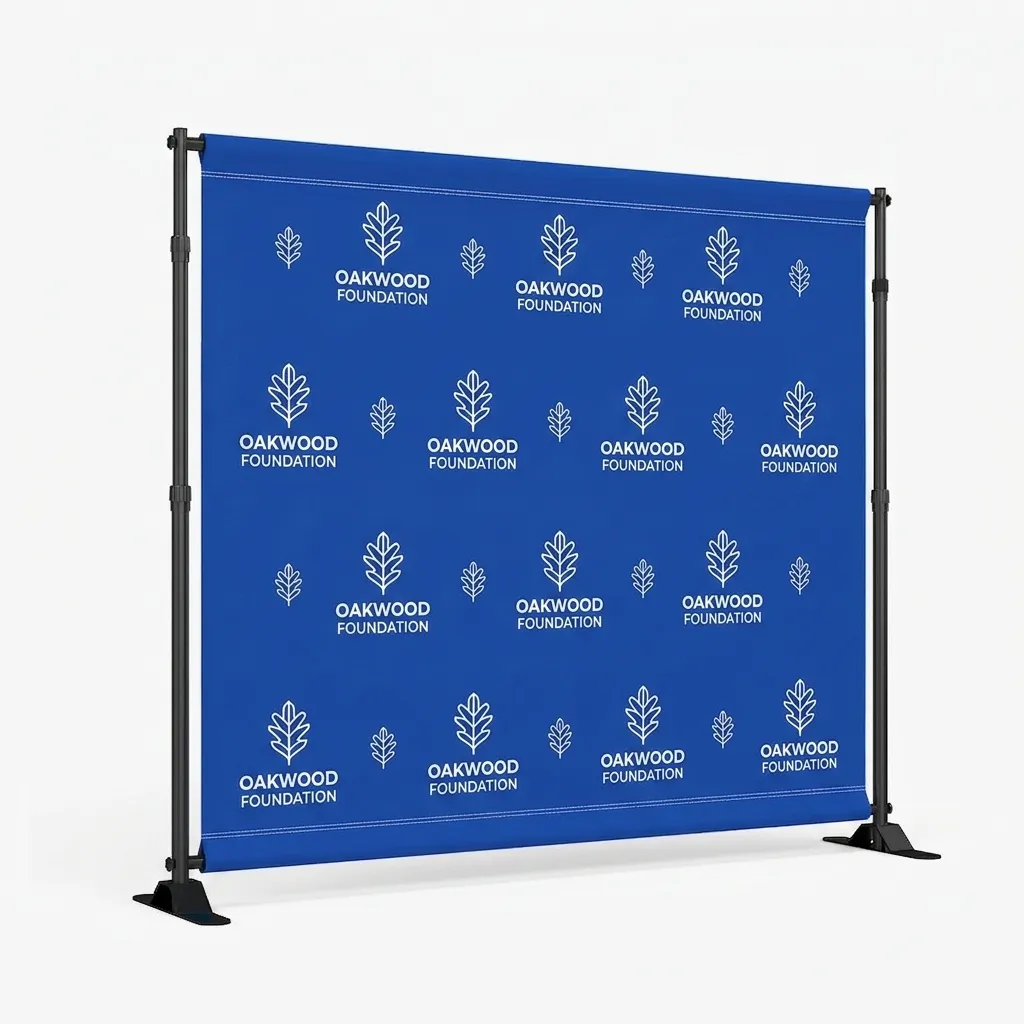
A step & repeat or fabric backdrop is the natural home for this focal message because it sits at head height behind the booth and fills the sightline from the aisle. Keep the headline short, high-contrast and large enough to read from across the walkway.
Plan layout and traffic flow
People avoid booths that feel like a trap. An open, welcoming footprint — with a clear way in and room to stand without blocking the aisle — consistently outdraws a booth walled off behind a table. A few layout principles:
- Open the front. Pull tables to the side or back rather than barricading the entrance; leave an obvious entry point.
- Create an aisle magnet. Put something eye-catching at the edge — a feather flag, a bright banner, or a demo — to stop traffic before it passes.
- Give staff a place to stand that invites approach, not a barrier to stand behind.
- Leave breathing room. Empty floor space reads as premium and lets people step in without feeling crowded.
Corner and end-cap positions get traffic from more directions — design so your message reads from each open side, not just the back wall.
Use a branding hierarchy
Think of your booth in three layers, each with a job:
- The big message (backdrop): who you are and why to stop — read from the aisle.
- Supporting messages (banner stands): two or three specifics — a product, an offer, a proof point — read as people approach.
- Interaction layer (table cover, demos, collateral): where conversations and hand-offs happen, read up close.
When each layer carries the right amount of information for its viewing distance, the booth guides the eye naturally from "what is this?" to "tell me more" to "let's talk."
Height, lighting and sightlines
Height buys visibility. Tall elements — a backdrop, a feather flag, or a canopy for outdoor and sponsor space — lift your brand above the crowd so it is seen from farther away. Wherever rules allow, use vertical space rather than spreading everything at table height.
Lighting makes graphics pop and signals investment. Backlit SEG displays or simple spotlights on your backdrop lift color and draw the eye, especially in convention halls with flat overhead lighting. Even inexpensive clip lights on a banner or backdrop noticeably improve how a booth photographs and reads.
Color and contrast
Use your brand colors, but prioritize contrast for legibility: dark text on a light panel or light text on a dark panel reads far better at distance than mid-tone on mid-tone. Limit the palette — two or three colors plus a neutral usually beats a rainbow — and keep the headline text high-contrast. Dye-sublimated printing reproduces solid brand colors, gradients and photos cleanly, so you have room to be bold without losing sharpness.
Designing a 10×10 booth
A 10×10 rewards restraint. Anchor the back wall with a single-message backdrop, add one or two retractable banners for support, brand the table with a fitted cover, and keep the front open. Resist the urge to fill every inch — negative space and one strong focal point will out-perform a crowded stand every time. If you exhibit outdoors, a printed canopy extends the same branding to entrances and sponsor areas.
Designing larger and double booths
With a 10×20 or island space, use the extra room for flow and function, not just more graphics: create distinct zones (greeting, demo, meeting), keep clear pathways through the booth, and repeat your core message on multiple sides so it reads from every aisle. A larger footprint is a chance to let people spend time with you — design for dwell, not just impressions.
Common booth-design mistakes
- Too many competing messages and no clear focal point.
- Tables barricading the front so the booth feels closed.
- Text too small or too low-contrast to read from the aisle.
- Everything at table height, with nothing using vertical space.
- No aisle magnet, so fast-moving traffic passes before noticing you.
- Cluttered floor with no room to step in and talk.
Design for your budget
Good design is not the same as expensive design. If budget is tight, spend it where the eye lands first: a strong, well-designed backdrop does more than several smaller pieces, so prioritize that focal element and add supporting banners over time. Portable, reusable displays also stretch a budget across many shows — a fabric backdrop and retractable banners fold into a case, travel as luggage, and set up without paid labor, which keeps per-show costs low. And because most systems let you reprint just the graphic and reuse the frame, you can refresh the look for a new campaign without rebuying hardware. Investing in one high-impact, reusable set almost always beats spending the same money on a booth that only works once.
Test your design before you print
The cheapest way to fix a booth is on screen, before anything is produced. Lay your design out at scale, step back, and run the three-second test: can someone tell what you do and why to stop, from across the room, in a glance? Check that headline text is large and high-contrast, that the focal message isn’t competing with clutter, and that logos and key words aren’t placed where a table or a person will block them. Every Apex order includes a free artwork proof, so you can confirm size, color, placement and spelling before it goes to production — use it. It’s far better to catch a too-small tagline or a low-contrast color on the proof than to discover it on the show floor.
Bring your booth together
Design the layers, then order them to match: a backdrop for the big message, banner stands for support, a table cover for the interaction zone, and a canopy or flags for outdoor visibility. Printing the whole set from one supplier keeps colors and branding consistent across every piece. See the trade show booth checklist to plan the rest, and the print coverage guide to get your artwork right.
Frequently asked questions
What makes a trade show booth stand out?
One clear focal point that reads in about three seconds from the aisle, an open and welcoming layout, height for visibility, good contrast and lighting, and a branding hierarchy that guides the eye from your headline to the details.
How do I design a 10×10 booth on a budget?
Keep it simple: a single-message backdrop, one or two retractable banners, a branded table cover, and an open front. Negative space plus one strong focal point beats a crowded booth.
Where should I put my main message?
On the backdrop at head height behind the booth, since that fills the sightline from the aisle. Keep the headline short, large and high-contrast.
Should I use lighting in my booth?
Yes where you can. Backlit displays or simple spotlights lift color and draw the eye under flat convention-hall lighting, and they make the booth photograph better.
How do I stop traffic that walks by quickly?
Add an aisle magnet at the edge of your space — a feather flag, a bright banner, or a live demo — so people notice and slow down before they pass.
How many colors should a booth use?
Usually two or three brand colors plus a neutral, prioritizing contrast so text reads at distance. A limited palette looks more professional than a busy, multi-color design.